storybook-addon-performance-panel
A Storybook addon for real-time performance monitoring. It surfaces frame timing, input responsiveness, layout stability, React profiling, memory pressure, and more — directly inside Storybook.
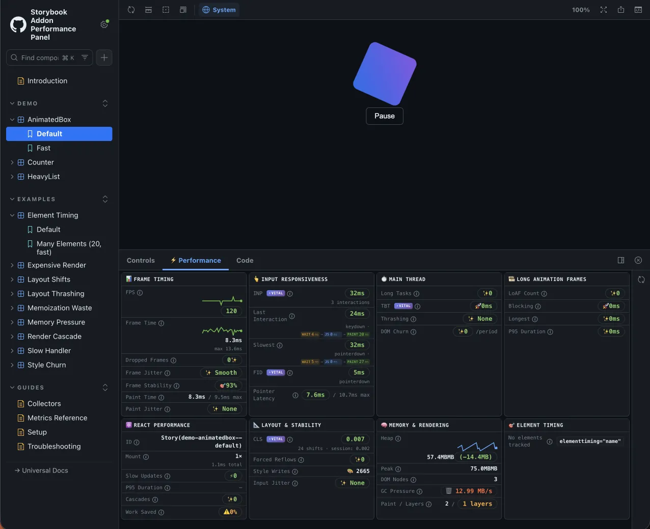
The panel appears as ⚡ Performance at the bottom of Storybook when viewing any story.
Why it exists
Performance regressions are hard to catch in code review. This addon gives you a live dashboard while you develop, so you can spot issues before they ship.
Features
- Frame timing — FPS, frame time, dropped frames, jitter, stability
- Input responsiveness — INP, input latency, FID, interaction breakdown with Inspect button
- Main thread — long tasks, TBT, thrashing, DOM churn
- Long animation frames — LoAF count, blocking duration, script attribution (Chrome 123+)
- Element timing — track specific elements with the
elementtimingattribute - Layout stability — CLS, forced reflows, style writes
- React performance — mount time, slow updates, P95 duration, render cascades
- Memory — heap usage, delta, GC pressure, compositor layers
Framework support
| Entry point | Frameworks | React Profiler |
|---|---|---|
| Default | React | Included |
./universal | HTML, Vue, Svelte, Web Components | Hidden |
The universal entry collects all browser-level metrics but omits React Profiler data. The React Performance section hides itself automatically.
Architecture

The decorator wraps each story in the preview iframe. Collectors gather metrics through browser APIs and send them to the panel through Storybook's channel.
Browser compatibility
| Feature | Chrome and Edge | Firefox | Safari |
|---|---|---|---|
| Core metrics | ✅ | ✅ | ✅ |
| Memory API | ✅ | — | — |
| Long animation frames | ✅ 123+ | — | — |
| Event Timing (INP) | ✅ | ✅ 144+ | — |
| Element Timing | ✅ | — | — |
Use Chrome or Edge for the most complete view while debugging.
Quick start
Install the addon:
npm install @github-ui/storybook-addon-performance-panelRegister it in your Storybook config:
// .storybook/main.ts
import type { StorybookConfig } from '@storybook/react-vite'

const config: StorybookConfig = {
  stories: ['../src/**/*.stories.@(ts|tsx)'],
  framework: '@storybook/react-vite',
  addons: ['@github-ui/storybook-addon-performance-panel'],
}

export default config
Compose the decorator in preview:
// .storybook/preview.ts
import addonPerformancePanel from '@github-ui/storybook-addon-performance-panel'
import { definePreview } from '@storybook/react-vite'

const preview = definePreview({
  addons: [addonPerformancePanel()],
})

export default preview
For non-React frameworks, use ./universal instead — see Getting Started for full setup options.